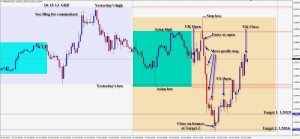
A nice move down for the GBP during the first half of UK session is followed by a reversal in the US session.
I’m going to show 2 different time intervals today to make a point – the 15 minute and the 60 minute charts. I like the 15 minute chart for trading but many institutional traders have their eyes on the 60, 240 minute and daily intervals.
We have a tremendous advantage in trading the 15 minute chart, because it sets up much faster, and reversals are evident much sooner which allows us to place smaller stop losses. We also can protect our profits along the way by seeing reversals setting up much sooner than on a 60 minute chart.
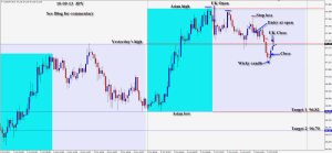
After the UK CPI y/y economic release, a beautiful short setup is evident on the 15 minute chart requiring an initial stop loss of 19 pips for a potential 74 pips to our Target 2. – See 15 minute chart below.
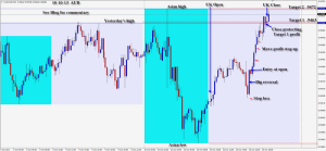
Now compare the 60 minute chart and how the institutional 60 minute traders are viewing the short. It is still a beautiful short setup, but the stop loss is 34 pips…which is too much for my style of trading.
Look to the left on the 60 minute chart at our Targets 1 & 2 levels. It is evident that price has bounced at those levels recently. This adds confluence to our targets and we want to be very cautious as price reacts to them. The target levels have nothing to do with support or resistance, but reading a larger chart enables us to gain additional perspective.
We use certain tools to add confluence to our entries and exits – being able to read and react to price, knowing the levels that institutional traders pay attention to – is very powerful.
Hope this helps. Send me a question if it is not clear to you.
Good luck with your trading!
Back tomorrow if we find a trade.